The answer is below this graph.Click on image to make graph larger.

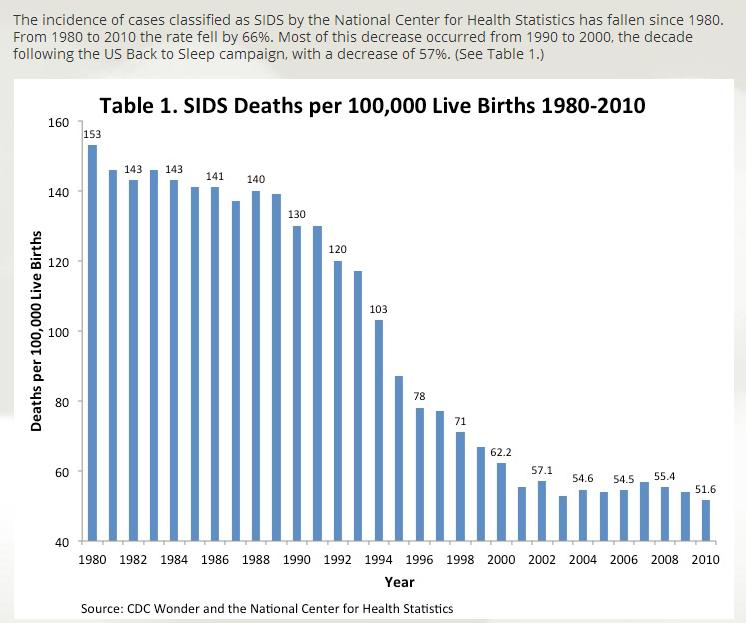
The first thing you should notice is that the number for 1980 is 153, and the number for 2010 is 51.6, which is a 66% drop (as stated in the text above the graph). You know that 66% is a little more than 50%, so the bar for 2010 should be a little more than 50% shorter than the bar for 1980.
If you literally measure on the screen, you actually get about a 95% drop by only looking at the bars. The image does not match up with the data.
But how did this happen? I will put the answer underneath this in white text. Highlight it if you want to see the answer or some hints first!
Hint: Look at the numbers going vertically on the left hand side. Could they have been spaced differently?
Hint: Look at the starting number.
Hint: What would make the two bars closer to the 66% difference?
Answer: The number in the corner starts at 40, and then it jumps by 20 each time. Imagine if that number were 50 instead. It would look like SIDS rates were 0 in 2010, wouldn't it? What number should be in the corner?
If you want to try different ideas to see how they affect a graph's appearance, here is a great page!
Just take some of the stats off this graph, or even just the largest and smallest and see what you can change to affect the bars and make them match the data.
Keep this in mind if you should ever need to create your own graph for a project!